Band Poster Dimensions
Posters are excellent advertising tools. With the right image, informative text and a knockout lay-out; posters can influence and motivate your target audience to do whatever it is you are suggesting on your poster; i.e. buy your products or avail of your services – or at least come check you out.
Band posters have been around since time immemorial and they continue to be around no matter which part of the world you are at.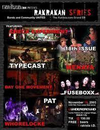
Posters allow bands to advertise their upcoming gigs, promote new albums or songs; and also just give their fans various images of the band so the fans can have something of the band’s to put on their walls – a constant reminder of the bands they love and admire.
Band Poster Dimensions
Whether you plan on making your own band poster or you wish to outsource the project, it is recommended that you first determine what size of poster you want. This will help you with the lay-out of the poster.
There are two general band poster dimensions that are widely-used today, whether for gig promotions or for some other purpose. These are actually considered as standard sizes for band posters and they come in the following dimensions: 18 inches in width by 24 inches in height; and 19 inches wide by 27 inches high.
These sizes are just right for them to be placed on walls or most any other flat, vertical surface.
You should also include a bleed area just so the poster will still look symmetrical once it is trimmed down to size.
Band Poster: Just the Essentials
You may be excited about your band’s upcoming gigs or the fact that one of your songs are finally being played on-air on your local radio stations; whatever your reason for creating a poster for your band; remember that short and sweet is always better than long and boring.
Do not get carried away by your excitement that you want to put everything that comes to mind on your poster! Stick to the bare essentials and complement these with an awesome image so your poster will create a positive impact on your target audience.
Too many elements crammed into one poster can spoil your message; upon which you will have wasted time, money and effort on your posters. Make a few rough drafts and lay-outs so you’ll have a few options to choose from.
It might also be a good idea to discuss your thoughts on poster design and content with a few people that you trust so they can also give you their inputs.
